Statistical Analysis by Dr. James E. Parks Department of Physics and Astronomy 401 Nielsen Physics Building The University of Tennessee Knoxville, Tennessee 37996-1200 Copyright August, 2000 by James Edgar Parks* *All rights are reserved. No part of this publication may be reproduced or transmitted in any form or by any means, electronic or mechanical, including photocopy, recording, or any information storage or retrieval system, without permission in writing from the author.
Objective: The objectives of this experiment are: (1) to understand how to find the average value, the median value, the standard deviations, and the standard deviation of the mean for a set of measurements that conform to a normal distribution, and (2) to use these values for a set of measurements to fit a gaussian distribution to the actual data. Another objective is to help become proficient in the use of an Excel spreadsheet for data analysis. Theory Probably the most elusive factor to establish in all of the experiments is to determine the degree of certainty in the results. The basic tool is the variance of the data. Probability and statistics is a very complex field. Many people have made a lifetime career in this area. Shelves full of books are available for reference. This experiment will be concerned with only the most rudimentary aspects of variability - the variance of a set of data and its interpretation. The most common parameter of a sample of data is the mean or average of the sample. The mean is the center of the distribution of values, and for a set of N measurements of a value X, is given by x , and x=
1 N ∑ Xi . N i=1
(1)
Often in measurements, a value xj will occur a number of times or with a frequency f(xj) when there are only M possibilities that can occur. In the case of rolling a single die (one of a pair of dice) there are only 6 possibilities, i.e. M=6. The number 2 (x2=2) may show
Statistical Analysis 200 times (f(x2)=200) if the die is rolled 1200 times. If N is the total number of events, then M
N= ∑ f ( x j ) .
(2)
j=1
and M
∑ f ( x )*x j
x=
j
j=1
N
.
(3)
Equation 3 states that the mean value x of a set of N values that have M possible values that occur f times, is equal to the sum of the product of f times x divided by N. The symbol representing variance is σ 2 . The standard deviation is simply the square root of this value. The formula for its calculation is, N
σ =∑ 2
i =1
(xi − x )2 N −1
(4)
The symbol Σ is the summation sign meaning that one simply adds the numbers in a group. The variance is drawn from the equation for the gaussian curve. (Normal, or bell curve or what have you.) This defines the probability of an occurrence that is subject to random variability and is, ( x-x )2 1 f (x) = exp . 2 σ 2π 2σ
(5)
This assumes the data are distributed normally. When conducting a test where many measurements are made, each measurement is usually a bit different, clustering around an average value. If the data are plotted on a frequency chart, most will fall close to the average, depending on the precision of the test. Drawing a line through the tops of the grouped values will usually give an approximation of the classic gaussian curve. One can usually identify an inflection point on each side of the average. The difference between the average and the inflection point is the magnitude of the standard deviation (sd) and when put into the gaussian equation will define the curve found by drawing the points on the graph. The importance of this is that 65% of the data will fall between plus and minus one sd of the average, assuming the average accurately reflects the true value. 95% will fall between plus or minus two sd's, and over 99% will be between plus or minus three sd's. Page 2
Statistical Analysis
We must consider the difference between accuracy and precision, and differentiate between random variability and systematic variability. Systematic variability is caused by a consistent error that comes from a fixed source, e.g. parallax, and affects every measurement to approximately the same degree and in the same way. The experimenter usually has control over such error once it is discovered. Random variability, on the other hand, is not generally controllable unless the experimenter can improve the equipment or circumstances of the test. One usually assumes that only random error affects a test and the measurements represent an accurate estimate of the desired result. An example is when in target practice the shots fall all over the place around the bulls eye and the average falls close to the bulls eye, or they cluster closely, but off target. Precision is when the shots fall close together, but if they are off target accuracy is poor. Of course the desired case is to have both accuracy and precision. A very important distinction must be made between the variance of an entire population and variance of a sample of the population. Consider the height of the male students on campus. If it were possible to get the figures, one could easily find the average height with great accuracy and precision. But if it weren't possible to get these figures, one could measure a few of the students and assume they represented the entire population. Obviously, if one measured the heights of the basketball team the results could be quite precise, but there would be a substantial systematic error. Which brings us to a critical factor in error analysis. ANY sample, to have validity, MUST be taken in a random manner. What is meant by this is that EVERY member of a given population must have an equal chance of being included in the sample. This raises an interesting phenomena of sampling technique. A properly taken sample of a huge population does not have to be terribly large if it is truly randomly chosen. For example, a randomly chosen sample of male students of about 100 would give a reasonably accurate estimate of the true average height (or any other quality) of the male student body. In common usage, the symbol σ refers to the true variablity of an entire population; usually only a part of a population is being examined and the variability is symbolized with the letter "s" for sample standard deviation. Sample variance is of course s2. Standard Deviation of the Mean A very important concept in error analysis is the standard deviation of the mean. The word 'mean' is synomymous with 'average'. The mean is symbolized as x or xm and the standard deviation of the mean is symbolized by sm or sx . What is meant by the standard deviation of the mean? Say 10 measurements were taken today and 10 more the next day and so on. A mean and sm is calculated for each set of Page 3
Statistical Analysis measurements. The standard deviation and mean of any one set of results is easily found and probability estimates can be made regarding any single measurement as to how close it may be to the true value. But what about the mean? How close is it to the 'true' value? For example, in one experiment we find a value for g, i.e. the acceleration of gravity using three measurements. From the data one can calculate a standard deviation and use this to estimate how close to any one measurement the true value should be, assuming no systematic error. But how close is the average of the three measurements to the true value? It is intuitive that the average gives a better estimate of the true value than any one measurement. For reasons beyond the scope of this discussion, the standard deviation of the mean, sm, is found by simply dividing the standard deviation by the square root of N, the number of measurements, or sm =
sd . N
(6)
In the above example where 3 measurements were made, the standard deviation of the mean is found by dividing sd for the 3 measurements by the square root of 3. Estimate of Error Finding the error term, i.e. the sd, can be a bit tricky in many cases. For example one common problem is the error involved in weighing something. One good way is to have two indepedent measurements. That is, of a pair of students, have each student weigh the sample independently, without prior comparison. Difference of the two measurements divided by the square root of 2 will provide an acceptable estimate of the sd. Keep in mind the error term is never zero, so sometimes an off the cuff estimate is the only way to go, using a guess that is usually about half the smallest increment allowed. E.g. if one can only weigh to the nearest gram, the error term cannot be less than a half gram. The standard deviation of any two values is simply the difference divided by the square root of 2, and one does not need to go through the labor of calculating the root-meansquare, which is what the standard deviation actually is. Given more than two values, the routine standard deviation will provide the desired estimate of error. Many of the experiments require a listing of the sources of error in descending order of importance. It is acceptable, although not always correct, to simply list the sources and the calculated or estimated standard deviation in descending order. Propagation of Error In many experiments in the lab the propagation of error will need to be addressed. Often a value is a result of a calculation such as the volume of a cylinder. Usually the only way
Page 4
Statistical Analysis to determine the standard deviation of such a value as the volume is to examine the standard deviation of each number that goes into the calculation of the sought after value. Usually only one of the contributing factors will dominate the final estimate of the standard deviation, not necessarily the one with the largest standard deviation. It is good practice to follow the procedures that have been outlined in the experiment on propagation of error, but a simple listing of the standard deviations will be accepted. There are occasions where full calculation of error through propagation of error is necessary. In such cases, the instructor will supply the procedure. Application Assuming there is no systematic error in a given test (for the most part, a questionable assumption), variability observed is assumed to apply to the scatter of data in a normal distribution pattern around the 'TRUE' value, e.g. acceleration of gravity, g=9.80. In the case where the true value and the variability is known, for a single measurement the question is, 'Do my results indicate that there is a systematic difference between what I have and the true value?' If the difference is within one sd, then it is readily explained by random error. More than 3 sd's indicate strongly that some systematic error has entered the test. Between 1 and 3 sd's is a grey area where judgement enters. As a practical matter, the variability true is seldom a known factor and the experimenter has to rely on the variation of the test itself. A single measurement does not offer any clue as to confidence if there is no associated estimate of variability, hence the need for these estimates, however questionable. Generally several measurements are made and a resultant sd can be found. The question in the case of multiple measurements is, 'Does the average of my test confirm the true value?' In this case one uses the sd of the mean (sm) to test with, a much tighter comparison. However, be careful not to apply the sm to a single result. Data do not always fall into the 'normal' pattern. There are other distributions that are common, mostly binomial or poisson. The standard deviation of data from a distribution other than normal cannot be used with confidence to test for accuracy. BUT, the sdm does usually fall into a normal pattern and can usually be used for testing for the most part. In the real world, one is often faced with the question of cause and effect. Management may not be aware that one cannot ever be 100% sure of an effect, but it helps to know the probability that an effect is real or not, and be able to know the risks. Method This experiment can be done either of two ways: (1) 4 dice are rolled and their sum are recorded 2000 times, or (2) 4 random generators each generates an integer between and 1 and 6, 2000 times, and is automatically recorded in the spreadsheet.
Page 5
Statistical Analysis
Procedure You are going to use Excel to simulate rolling four dice 2000 times and finding the total of the four dice for each roll. You will then use the statistical tools talked about above to find the mean and standard deviation. You will also use the data to construct a histogram and find how well it fits a gaussian distribution. 1. Open an Excel spreadsheet by double clicking the Excel icon on the desk top, and enter the labels in the cells as shown in Figure 1.
1
2 3 4
A B C Statistical Analysis of Data
Dice 1
Dice 2
Dice 3
D
E
F
Dice 4
Dice Sum
Deviation From Mean
G
H
I
J
K
L
M
Mean
Standard Deviation
Roll Sum
Measured Frequency
Frequency X Roll Sum
Calculated Gaussian Distribution
Standare Deviation Of the Mean
Figure 1. Excel spreadsheet labels. 2. In cell A1 enter “=RANDBETWEEN(1,6)” which is a function that generates integer numbers between 1 and 6. After this function has been entered into the cell, examine the number and verify that it is a number between one and six. Press the F9 key several times while observing how the number changes, still remaining a number between 1 and 6. 3. Copy this same function into cells B1, C1, and D1. Press the F9 key again several times and observe the numbers as being random numbers between 1 and 6. 4. Highlight cells A3:D3 and from the menu bar chose Edit-Copy. Now click on cell A4 and hold down the mouse button and drag your mouse down to cell A2003. You have selected cells A4:A2003. From the menu bar click Edit-Paste. 5. In cell E3 type "=SUM(A3:D3)" and hit enter. This puts the sum of the four dice in cell E3. As above click on cell E3 and chose Edit-Copy, then click on cell E4 and hold down the mouse button wile dragging your mouse down to E2003 then chose Edit-Past. 6. You have just let Excel roll four dice 2000 times and summed their totals. If you press F9 Excel will roll the dice another 2000 time and recalculate the sums. 7. This step is a very important step. It can save you much time and paper. The Excel spreadsheet that you have just created can take as many as 55 pages to print out. However, most of the data are of no interest to examine as individual values, and only the first and last half of the pages at the beginning and end are of interest. The large central portion of the spreadsheet can be hidden so that it does not show up on the screen nor does it appear in a printout. To hide these Page 6
Statistical Analysis rows of data do the following: Put the mouse cursor in any cell in row 29 and select that cell be clicking on it with the left mouse button. Then while holding the left mouse button down, drag the cursor down to the cell in the same column located in row 1997. After these cells have been selected from row 29 to row 1997, choose the “Format” option from the main menu bar and then “Row” and “Hide” options from the pop up menus that follow. Although the data does not show, the data can still be referenced and used in the Excel computations. 8. To prepare a histogram you first need to build a frequency table. In column I make a list of all possible values the sum of the 4 dice can result in. Starting in cell I3 enter the number 4 and increase the number in each cell by 1 until the number in cell I27 is 24. 9. Click on cell J3 and while holding the left mouse button down, select cells J3 through J23. Type "=FREQUENCY(E3:E2002,I3:I23)" but DO NOT HIT THE ENTER KEY. “FREQUENCY” is an Excel function whose input and output values must be arrays. In Excel, array functions are entered differently. To enter the frequency function after you have type it into the formula bar, you must first hold down the Ctrl and Shift keys together, and while holding them down, then press the Enter key. (Another way to enter functions is to choose “Insert” from the main menu bar, and then the “Function” option. This will give a dialog box in which the final step consists of clicking on the “OK” button. However, with array functions in Excel, you must hold down the Ctrl and Shift keys before clicking on the “OK” button.) This operation will show the frequency or number of times out of the 2000 rolls that the sum of the 4 dice will equal each of the 21 numbers in column I. 10. As a check of the numbers in the frequency distribution, the sum should be equal to the number of rolls. Therefore, in cell J24 enter a formula to sum the numbers in cells J3 through J23 by typing “=SUM(J3:J23)”. Verify that this sum is equal to the number of rolls, i.e. 2000. 11. Make a histogram graph by first selecting cells J3 through J23. Choose “Insert” from the main menu bar of Excel and then “Chart” from the options. Under “Chart type” chose “Column,” choose the first block under “Chart sub-type,” and then click “Next.” 12. In the Chart Source Data dialog window, click the “Series” tab. The “Values” text box should show “=Sheet1!$J$3:$J$23” and the “Series” pull down list box should show “Series1.” Click the little red arrow on the right of the “Category (X) axis labels box” input box. This will open up another input box. Type “=Sheet1!$I$3:$I$23” or select cells I3 through I23 with your left mouse button. Press Enter or click the red arrow at the left of the input line. 13. Click the “Next” button to go to the next dialog window to add titles and labels. Enter “Gaussian Distribution” for the Chart title, “Sum of Rolls” for the Category (X) axis label, and “Frequency” for the Value (Y) axis.
Page 7
Statistical Analysis
14. Type “Next” and the “Finish” in the next dialog window. This will place a small chart on your spreadsheet. You may resize or move it around on your spreadsheet by clicking on the chart near its boundary which will bring up a border with sizing points in the corners and at the center of the borders. You may click on the graph near this border and while holding the left mouse button down, you may move it anywhere on the spreadsheet. 15. Calculating the Mean and Standard Deviation using Excel is as easy as typing in the formula. To calculate the mean, type "=sum(E3:E2003)/2000" in cell G3 and “Enter”. 16. As a check of the mean you have just calculated, begin first by entering the expression “=I3*J3” into cell K3. Then copy K3 into cells K4 through K23. Find the sum of values in cells K3 through K23 by entering the formula “=SUM(K3:K23) in cell K24. Lastly, calculate the mean in cell K25 by entering the formula “=K24/J24”. This value should be equal to mean you just calculated in the previous step in cell G3. This should illustrate the definition of the mean as calculated from a frequency distribution as defined in Equation 3. 17. To calculate the Standard Deviation you must first find the deviation of the sums
(
from the mean, X − X cells F4 through F2002.
). 2
To do this in cell F3, type "=(E3-$G$3)^2" and copy in
18. The standard deviation is determined from the square root of σ2 as given by Equation 4. Type "=SQRT(SUM(F3:F2002)/1999)" in cell H3 to find the standard deviation. 19. You now have the mean value and the standard deviation. You can now write the sum of four dice, for example, as 13.95±3.45. 20. Equation 5 is the normalized gaussian distribution which gives the probability that the number x will be the sum of the dice in any one roll. For 2000 rolls, the frequency that the number x is the sum will be given by Equation 5 multiplied by 2000. 21. You can now calculate the frequency distribution to see if it fits your measured frequency distribution. In cell L3 type in Equation 5, the formula for a gaussian distribution, “=2000*(1/((SQRT(2*PI())*$H$3)))*EXP(-((I3-$G$3)^2)/(2*($H$3^2)))". This is a long formula so be careful. Now, copy L3 into cells L4 through L23. The numbers in this column should be approximately equal to those in column J.
Page 8
Statistical Analysis 22. In cell L24 enter a formula to sum the numbers in cells L3 through L23 by typing “=SUM(L3:L23)”. The sum should be approximately equal to the number of rolls, i.e. approximately 2000. 23. Add the calculated frequency distribution to the chart of your measured frequency distribution. To do do this, first left click on the inside of the chart box near the border and then click on the “Chart” option on the main menu bar. Choose the “Source Data . . . “ option to open the Source Data dialog window. With the “Series” tab chosen, click on the “Add” button under the “Series” list box, and then type “=Sheet1!$L$3:$L$23” in the “Values” input box and “OK”. This should add another set of columns to the column graph for the calculated data set. As an alternative to typing in the Values entry, click the red arrow to the right of the “Values” input box. This will open another one line dialog window, “Source Data – Values:” to enter the data location of the new data. With the left mouse button, select cells L3 through L23 and then click the red arrow to the right of the Source Data – Values text box. 24. A second set of column bars should now have been added to the column graph for the calculated data set. Since this is the calculated frequency distribution, it would be nice to display it as a continuous line plot. To do this, select the new column set by left clicking on one of the new column bars. (When you place the mouse cursor on one of the bars, a little text box appears indicating the series and value for that column bar. This helps to make sure that you have chosen the right data to re-format display.) Click on “Chart” from the main menu bar and then choose “Chart Type . . . ” from the options. Select “XY (Scatter)” from the Chart type list in the dialog window that appears. Choose the smooth line without data points option (the third sample) under the Chart sub-type options and then “OK”. This should draw a smooth line of the frequency distribution and should encompass the bar chart showing a good fit. 25. You can use options found in Excel to re-format the graph and display it in a more pleasing manner. For example, you can change the line format by first left clicking on the line to select it and then clicking on “Format” from the main menu bar. Click on “Selected Data Series . . . ” and this will open up the Format Data Series dialog window. Under the “Patterns” tab and line group, choose the “Custom” option and the select a different color and thicker weight for the smooth line. You can right click on various parts of your chart to display various menu options to format the appearance of your plot. Experiment with these options to change the plot as you may desire.
Page 9
Statistical Analysis
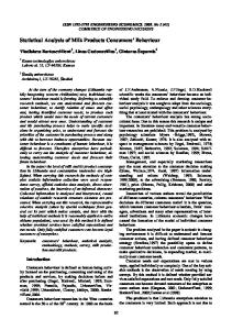
Gaussian Frequency Distribution
Frequency of Sum
250 200 150 100 50 0 4 5 6 7 8 9 10 11 12 13 14 15 16 17 18 19 20 21 22 23 24 Sum of Dice
Figure 2. Typical chart of measured frequency distribution and fit of gaussian function. 26. For the final calculation calculate the standard deviation of the mean in cell M3 by using Equation 6. To do this, enter “=H3/SQRT(J24). Each time the F9 key is depressed, the dice are rolled another 2000 times and all the calculations are automatically repeated. Depress the F9 key several times and wait after each time for Excel to complete all the calculations and re-chart the data. (This can take as much as 15 seconds or more, depending on the speed of the computer.) Notice the changes in the mean and determine whether or not the variations in the mean are on the order of the standard deviation of the mean that you have just calculated. 27. Again, to avoid potential problems in printing your data and worksheet, carefully follow these printing directions. First, select the area of the worksheet that you wish to print out. This should include cells A1 through M2006. From the main menu bar, select “File” and then “Print Area” and “Set Print Area” from the pop up menus that follow. 28. Choose “File” again from the main menu bar and “Page Setup” from the pop up menu. This will open the Page Setup dialog window. Under the “Page” tab click on the “Landscape” button and the “Fit to” options button. Make sure that the number “1” appears in both input boxes so that “Fit to 1 page wide by 1 tall” is specified. Under the “Sheet” tab, click on the “Gridlines” and “Row and column headings” check boxes so that a check mark appears in each. Verify that the “Print area” input box has A1:M2006. You may add a header or footer if you like and then click on “OK”. 29. Choose “File” again from the main menu bar and “Print Preview” to preview the print and to verify that only one page will be printed. Make sure that your chart appears on your worksheet preview and close this window by clicking on the “Close” button.
Page 10
Statistical Analysis 30. To print your results, choose “File” again from the main menu bar and “Print” and “OK”. Your printout should look similar to the one in Figure 3.
Figure 3. Sample printout of Excel spreadsheet.
Page 11